flowchart LR
  A["Log data<br/>(1 row per event)"] --> B["Cross join<br/>with calendar spine"]
  B --> C["Filter to<br/>active periods only"]
  C --> D["Scaffolded data<br/>(1 row per event per day)"]
Data Scaffolding with R
r
tidyverse
lubridate
data engineering
Log data records when events start and end — but not how many were active at once. This post shows how data scaffolding transforms sparse event logs into a continuous daily timeline, unlocking time-based metrics like concurrent demand, utilization rates, and peak periods.
Imagine you manage a fleet of rental cars. You have a booking system that records when each rental started and when it ended. Simple enough. But now your manager asks: “How many cars were out on the road last Tuesday?” You open the data — and realise you can’t answer that question. Not directly. Every row is a booking. None of them tells you about Tuesday.
This is the blind spot built into every log dataset. By definition, a log records events: a start and an end. It does not record state: what was happening between those two points. That gap is where data scaffolding closes the problem.
Scaffolding expands a log dataset into a continuous, day-by-day timeline. Once you have it, questions like “how many were active on Tuesday?” become a simple count(). You can finally measure:
- Concurrent demand — how many events were active on any given day
- Demand peaks — which weeks or months carry the highest load
- Average concurrent load — mean active subscriptions per month, open tickets per week
- Overlap bottlenecks — periods where too many events are active simultaneously
- Utilization rate — active events as a share of total available capacity
This post walks through the technique step by step, using a car rental dataset as the example. The same approach works for employee records, hospital admissions, project assignments, subscriptions — any data where duration matters more than the event itself.
How scaffolding works
It helps to see what you’re building before writing any code. Here is the shape of the problem:
Take two bookings as an example. Booking R001 ran from Jan 1 to Jan 3. Booking R002 started Jan 2 and has no return date — an open trip.
Before scaffolding, that is two rows of data. After scaffolding, each booking expands into one row per day it was active:
- R001 becomes 3 rows: Jan 1, Jan 2, Jan 3
- R002 becomes rows from Jan 2 through the end of your analysis window
Now a group_by(calendar) %>% summarise() tells you exactly how many bookings were active on each day.
Step 1 — Load and parse the data
The dataset records each booking’s start (from_date) and end (to_date) as datetime strings — for example, "1/1/2013 22:33". R reads these as plain text. Before you can compare them to calendar dates, you need to convert them.
lubridate::mdy_hm() parses the M/D/YYYY HH:MM format into proper datetime objects. From there, lubridate::as_date() strips the time component and gives you a plain calendar date — which is what you need for a daily scaffold.
You will also add a helper column key = 1 to every row. That single column is what makes the cross join in Step 2 possible.
Code
library(tidyverse)
library(lubridate)
library(scales)
library(showtext)
library(ggtext)
library(slider)
library(glue)

df <- readr::read_csv("data/raw/SAR Rental.csv")

df2 <- df %>%
  mutate(
    from_date     = lubridate::mdy_hm(from_date),
    to_date       = lubridate::mdy_hm(to_date),
    from_date_day = lubridate::as_date(from_date),
    to_date_day   = lubridate::as_date(to_date),
    key = 1
  )
You now have a clean date column for each end of every booking. The next step builds the other half of the join: the calendar.
Step 2 — Create the calendar spine and cross join
The calendar spine is a simple table: one row per day, covering your full analysis window. Its only purpose is to give every date a place to sit when you expand the bookings.
To avoid hardcoding an end date, derive it from the data itself.
Live data? Use
today() instead
Here we anchor the calendar end to max(from_date_day) in the dataset. If you’re working with a live feed that receives new bookings continuously, replace max_date with lubridate::today() to always extend the scaffold to the current date — no manual updates needed.
What is a cross join?
A cross join (also called a Cartesian product) combines every row from one table with every row from another — no matching condition required. If table A has 100 rows and table B has 365 rows, the result has 100 × 365 = 36,500 rows.
Here we simulate it using left_join() on a constant key = 1 column added to both tables. Since every row on both sides shares the same key value, every booking matches every calendar date — which is exactly the Cartesian product we need. dplyr 1.1.0+ also exposes this directly as dplyr::cross_join().
Code
max_date <- max(df2$from_date_day, na.rm = TRUE)

calendar  <- seq(lubridate::ymd("2013/01/01"), max_date, by = "days")
date_dim  <- tibble::as_tibble_col(calendar, column_name = "calendar")

date_dim <- date_dim %>%
  mutate(key = 1)

df2 <- dplyr::left_join(df2, date_dim, by = "key", relationship = "many-to-many")
The key = 1 column you added in Step 1 is the trick here. Because every booking row has key = 1 and every calendar row has key = 1, the join matches every booking against every date. That is not a mistake — it is the point.
This join pattern simulates a cross join: a Cartesian product that pairs every row from one table with every row from another. If your bookings table has 100 rows and your calendar has 365 days, the result has 100 × 365 = 36,500 rows. (Since dplyr 1.1.0, you can also use dplyr::cross_join() directly — no dummy key needed.)
Passing relationship = "many-to-many" tells dplyr the Cartesian product is intentional. Without it, dplyr would raise a warning when it detects the unspecified many-to-many match.
You have now created every possible booking–date pair. Step 3 discards the ones that do not make sense.
Step 3 — Filter to active records
The cross join created millions of rows — one for every combination of booking and date. Most of them are noise. A booking from January should not appear in October.
The filter keeps only the rows where the calendar date falls inside the booking’s active window: on or after the rental started, and on or before it ended.
Code
df2 <- df2 %>%
  filter(
    calendar >= from_date_day
    & (calendar <= to_date_day)
    # For this analysis, I will drop NA values in the to_date_day field
    # & (calendar <= to_date_day | is.na(to_date_day))
  )
What remains is exactly what you needed all along: one row per booking per day the booking was active. This is the scaffolded dataset.
Results
With a daily dataset in hand, you can flag any reporting boundary you care about. Here you mark the last day of each month and the last day of each week — the two most common cadences in operational reporting.
Code
df2 <- df2 %>%
  mutate(
    month_last_day   = lubridate::ceiling_date(calendar, unit = "month") - lubridate::days(1),
    active_month_end = dplyr::if_else(calendar == month_last_day, key, 0),

    week_last_day    = lubridate::ceiling_date(calendar, unit = "week") - lubridate::days(1),
    active_week_end  = dplyr::if_else(calendar == week_last_day, key, 0)
  )
Summing active_month_end per month gives you the active rental count at month close. The same logic applies to any reporting period — quarters, fiscal years, custom windows. Group by calendar date and count distinct bookings active on each day. The demand curve that was invisible in the log data becomes a single summarise().
Code
font_add_google("Fira Sans")
font_add_google("Source Sans 3")
showtext_auto()
showtext_opts(dpi = 300)

title_font <- "Fira Sans"
body_font  <- "Source Sans 3"
accent_col <- "#1696d2"
avg_col    <- "#e05c00"

daily_active <- df2 %>%
  dplyr::group_by(calendar) %>%
  dplyr::summarise(active_rentals = dplyr::n_distinct(`row#`)) %>%
  dplyr::mutate(trailing_avg = slider::slide_dbl(active_rentals, mean, .before = 14, .after = 0, .complete = TRUE))

weekly_active <- df2 %>%
  dplyr::group_by(week_last_day) %>%
  dplyr::summarise(active_rentals = sum(active_week_end, na.rm = TRUE)) %>%
  dplyr::filter(lubridate::year(week_last_day) == 2013) %>%
  dplyr::mutate(iso_week = lubridate::isoweek(week_last_day))

monthly_active <- df2 %>%
  dplyr::group_by(month_last_day) %>%
  dplyr::summarise(active_rentals = sum(active_month_end, na.rm = TRUE)) %>%
  dplyr::filter(lubridate::year(month_last_day) == 2013) %>%
  dplyr::mutate(month_last_day = lubridate::floor_date(month_last_day, unit = "month"))

base_theme <- ggplot2::theme_minimal(base_family = body_font, base_size = 8) +
  ggplot2::theme(
    plot.title            = ggtext::element_textbox_simple(
      family = title_font, size = ggplot2::rel(1),
      margin = ggplot2::margin(b = 3)
    ),
    plot.subtitle         = ggtext::element_textbox_simple(
      size = ggplot2::rel(0.9),
      margin = ggplot2::margin(b = 5)
    ),
    plot.title.position   = "plot",
    axis.title            = ggplot2::element_blank(),
    axis.text.x           = ggplot2::element_text(face = "bold", size = ggplot2::rel(1)),
    axis.text.y           = ggplot2::element_text(size = ggplot2::rel(0.8)),
    panel.grid.major.x    = ggplot2::element_blank(),
    panel.grid.minor      = ggplot2::element_blank()
)Code
daily_active %>%
  ggplot2::ggplot(ggplot2::aes(x = calendar, y = active_rentals)) +
  ggplot2::geom_area(fill = scales::alpha(accent_col, 0.15), colour = NA) +
  ggplot2::geom_line(colour = accent_col, linewidth = 0.7) +
  ggplot2::geom_line(ggplot2::aes(y = trailing_avg), colour = avg_col, linewidth = 1, na.rm = TRUE) +
  ggplot2::scale_x_date(
    date_breaks = "1 month",
    labels = function(x) toupper(substr(format(x, "%b"), 1, 1)),
    limits = c(lubridate::ymd("2013-01-01"), lubridate::ymd("2013-12-31")),
    expand = c(0, 0)) +
  ggplot2::labs(
    title    = "**How many rentals were active each day?**",
    subtitle = glue::glue(
      "<span style='color:{accent_col}'>Daily active rentals</span> with ",
      "<span style='color:{avg_col}'>15-day trailing average</span> (current day + 14 previous)"
    )
  ) +
  base_theme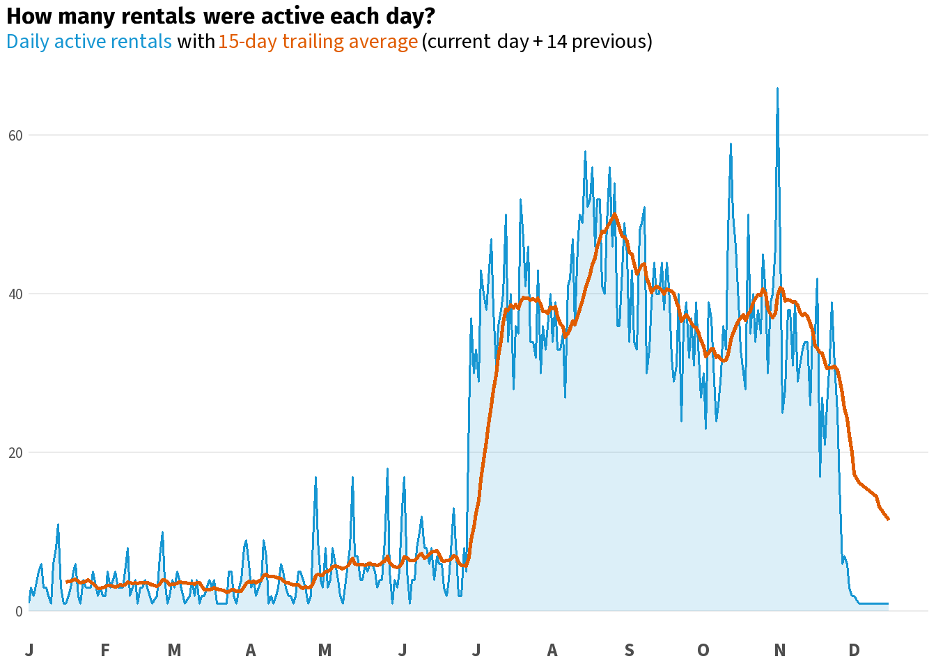
Code
weekly_active %>%
  ggplot2::ggplot(ggplot2::aes(x = iso_week, y = active_rentals)) +
  ggplot2::geom_area(fill = scales::alpha(accent_col, 0.15), colour = NA) +
  ggplot2::geom_line(colour = accent_col, linewidth = 0.7) +
  ggplot2::scale_x_continuous(
    breaks = seq(1, 52, by = 4),
    labels = function(x) paste0("W", x),
    expand = c(0, 0)) +
  ggplot2::labs(
    title    = "**How many rentals were active at the end of each week?**",
    subtitle = glue::glue("<span style='color:{accent_col}'>Active rentals on the last day of each ISO week</span>")
  ) +
  base_theme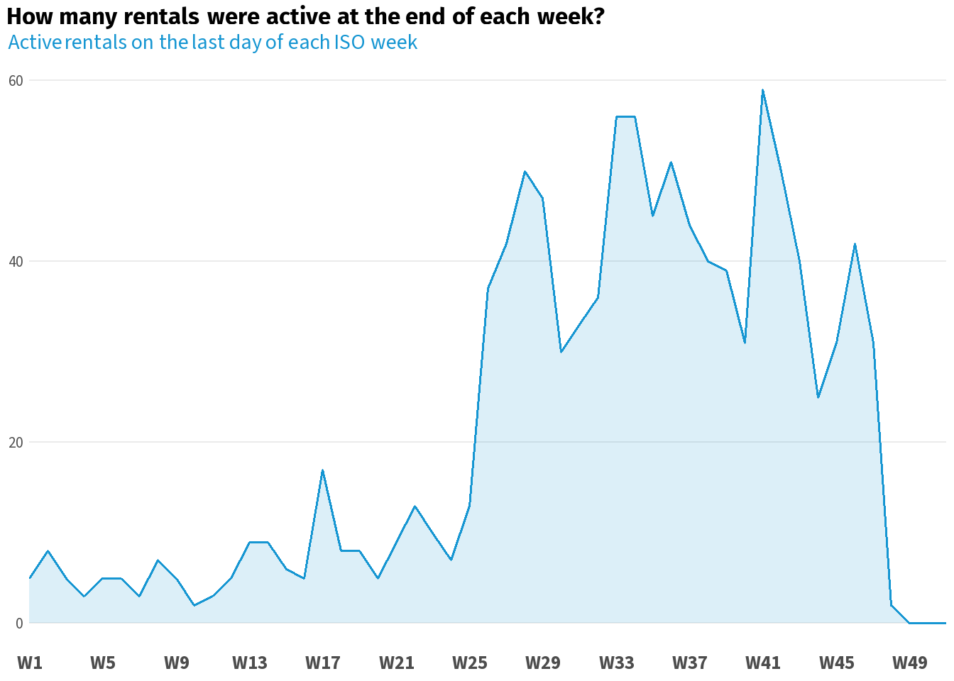
Code
monthly_active %>%
  ggplot2::ggplot(ggplot2::aes(x = month_last_day, y = active_rentals)) +
  ggplot2::geom_area(fill = scales::alpha(accent_col, 0.15), colour = NA) +
  ggplot2::geom_line(colour = accent_col, linewidth = 0.7) +
  ggplot2::scale_x_date(
    date_breaks = "1 month",
    labels = function(x) toupper(substr(format(x, "%b"), 1, 1)),
    limits = c(lubridate::ymd("2013-01-01"), lubridate::ymd("2013-12-31")),
    expand = c(0, 0)) +
  ggplot2::labs(
    title    = "**How many rentals were active at month close?**",
    subtitle = glue::glue("<span style='color:{accent_col}'>Active rentals on the last day of each month</span>")
  ) +
  base_theme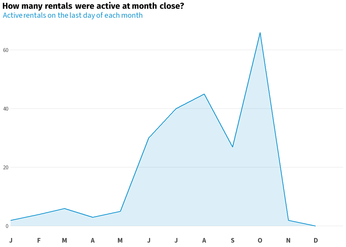
Wrapping Up
You started with a booking log that could not answer “how many cars were out on Tuesday?” You now have a dataset that can answer that question for every day, every week, and every month in your analysis window.
The pattern is always the same: parse your dates, build a calendar spine, cross-join, filter records. The same steps work for any log dataset — employee headcount, help desk tickets, hospital bed occupancy, subscriptions. Wherever your data records intervals rather than snapshots, scaffolding is the tool that turns those intervals into a timeline you can actually analyse.